17
Jun
Posted By Avonlea Kitchen + Bathroom Concepts
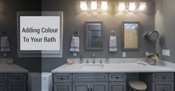
Remodeling Baths with New Colour Combinations
We believe in mixing colours to make something bold and personal, however not all combinations are winners. To avoid going too far off the beaten track, here are our recommendations for combinations that are completely unique and highly attractive!
Soothing and mysterious
Designers love mixing midnight blue, turquoise, and apple green for wallpapers and wall paints. The colours come from similar families so they complement each other easily. Having only turquoise and apple green might seem too Tropical Island, but including a dark blue is a surprising contrast to give the combination character.
You don’t have to worry about using such a dark colour in a room because the brightness of the other two colours will lift and brighten the space, meaning it won’t shrink with the light-absorbing midnight blue.
Refreshingly rustic
For homeowners who prefer a simpler design, going rustic means that not every part of the furnishing has to complement each other perfectly.
A common issue with the rustic theme is that it seems well-worn or even one dimensional. To modernize this theme, we’ve added a splash of citron green to sandy brown and creamy white. The white and brown have warm undertones, so the green is used to refresh the colour scheme. A number of colours could have been used to modify the white and brown, but we’ve chosen green because it picks up on the most common colour in nature.
Light and bright
Having only one colour in a room can underwhelm you and make things seem boring, however when it comes to white, lighting plays a huge factor in how we see it.
We’re going for something more subtle in this case with a combination of sea foam, cottage white, and silver. If you’re concerned about not having enough colour in a room, making everything seem washed out, don’t go overboard with the sea foam.
Edgy and minimal
We’ve thrown chalkboard black, walnut, and pure white into the mix for a much more bold combination. If black is too much of a risk, you can consider chalkboard grey, but avoid green undertones and aim more for a bluish hue. If you can manage wooden furnishings or even exposed beams, it could turn a regular room something you’d see in a loft. If you’re going to add pattern to the space, make sure it’s bold to match the statement made by the colour combination.
For more design inspiration ideas, check out past work done by our Avonlea experts!
Leave a Comment
The comments are closed.